Case Study
Museum of Worcester
How a 150-year-old institution dropped its name, found its voice, and reclaimed its city.
Rick Cinclair / Telegram & Gazette
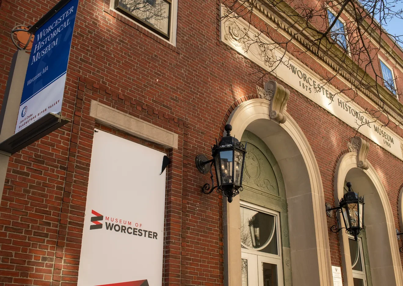
A Ceiling Disguised as a Name
The Situation
The museum’s WordPress website had become a reflection of years without a clear digital strategy. Pages duplicated each other. Content was buried or outdated. Navigation was confusing. But the website was a symptom, not the disease. There was a deeper issue, stemming from the name itself.
“Historical” had become a ceiling. It cast the museum as a place that only looked backward, when the team was ready to be recognized for moving in more directions: preserving the past, engaging the present, shaping the future. They wanted to be a living part of the community, a place where Worcester’s collective identity could be explored and celebrated. But the name kept drawing them back into a box they had long since outgrown.
For nearly 150 years, the Worcester Historical Museum had been woven into the cultural fabric of the city. The people behind it were passionate, committed, and proud. Board members, staff, volunteers: all of them believed in the institution’s mission. That belief was never in question. What was in question was whether the outside world could see what they saw.
"Historical, I think, to some people sounds dusty. When it's Museum of Worcester, it's more welcoming to the public. Everyone has a place here."
— Vanessa Bumpus, Director of ExhibitsWith the museum’s 150th anniversary approaching in 2025, the window for reinvention was open. But it would not stay open forever.
I was connected to the museum through an existing client relationship. The initial ask was simple: build us a better website. But within the first few conversations, it became clear that a new website alone would not solve the underlying challenge. There was a new story that needed to be told. This was going to start at the very top.
Getting the Lay of the Land
Phase One - Listen
Before pushing any pixels, I needed to understand the full landscape. Who were the decision-makers? What did they value most? Where did opinions converge, and where would I encounter friction?
I started with structured research: a survey distributed to the board of directors, museum staff, and select community members and volunteers with a close relationship to the institution. The board and staff responses formed the foundation of the findings. The broader outreach helped gauge how the museum was perceived outside its own walls.
The findings were illuminating. Roughly half of respondents still carried attachment to the existing brand, but nearly every submission expressed a hunger for something new. The passion for the institution came through on every response. These were people who cared deeply about what the museum represented. They just needed a direction.
Even the museum’s signature red, which I had expected to be a sticking point, was open for discussion. The vast majority welcomed meaningful change. That kind of openness from a legacy institution is uncommon. It signaled a team serious about transformation, not just iteration.
My role was to channel this appetite and excitment into a direction the entire organization could rally behind.
The survey confirmed what early conversations had hinted at: a name change was on the table. Not everyone had arrived there yet, but the appetite was real.
From Concept to Complete Brand System
Phase Two - Build
The Naming.
Naming is the most personal part of any rebrand. Everyone has an opinion, and everyone's opinion feels correct to them. The process required extensive exploration. Multiple concepts were developed, presented to stakeholders, and pressure-tested against cultural, community, and strategic considerations.
Where we landed was the Museum of Worcester. It is a subtle but meaningful inversion. It says: this place belongs to Worcester. It belongs to you. And it retires the one word that had been confining the museum to a single dimension for decades.
Museum of Worcester puts the city first. It says: this place belongs to you.
The Identity.
The logomark was built to carry meaning well beyond its surface. Every brand begins with a line, and in this case, it starts with two: an angled downstroke representing the past, which connects to an angled vertical stroke representing the future. The point where they meet is the present. These strokes represent the stories that are repeated over and over. Every event, every exhibit, every person: the past influences the present and together they shape the future. This repeated pattern also creates a helix, subtly underlining the human element of the museum.
The truncation of the pattern to two sets of strokes can be read as a “W” for Worcester or an “M” for Museum, depending on orientation. It is also a metaphor: a museum can only ever show fragments of history. Many people, artifacts, and stories have been lost to time. What remains is what we choose to preserve.
The two primary strokes also mirror the museum’s two main floors, grounding an abstract symbol in the physical reality of the building. And the city’s own identity as the second most populous in New England finds a quiet echo in the mark’s structure. That embedded flexibility was deliberate. It gives the brand a conceptual depth that reveals itself gradually, rewarding closer inspection rather than announcing itself all at once.
The color palette expanded the museum’s visual vocabulary. Rather than abandoning the heritage red entirely, we retained it as a foundational color to preserve continuity with the institution’s history. It became an anchor within a broader, more versatile system: a warm copper, a deep midnight, a canal blue, and lighter accent tones, each named for Worcester’s character. Brick, Midnight, Canal, Copper, Sky, Powder.
The versatility was intentional. A museum is not a single-message brand. It needs to communicate differently for a black-tie ball than it does for a children’s program. The palette was engineered to accommodate all contexts without losing coherence. One identity, many expressions.
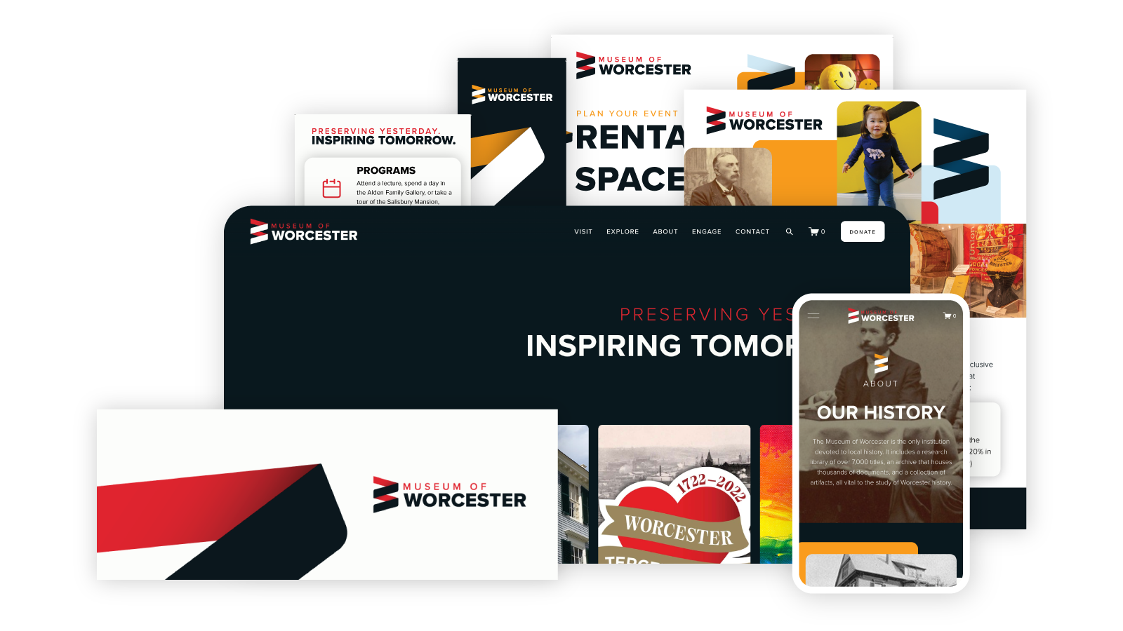
The Website.
With the brand identity in place, the team turned to the website. We moved the museum from WordPress to Squarespace, not because WordPress is inherently flawed, but because the museum’s staff needed a system they could realistically manage on their own. I believe in empowering clients to take ownership of their platforms wherever possible. It creates fewer bottlenecks, faster updates, and a healthier long-term relationship between an organization and its digital presence.
The content strategy was as consequential as the design. The old site had accumulated years of duplicate content, outdated listings, and sections that served no clear purpose. We restructured everything from scratch, organizing the site into four intuitive navigation buckets (Visit, Explore, About, and Engage), each informed by research into how other museum websites handle similar complexity. A homepage carousel gives the museum a way to promote rotating programs and events without cluttering the page, and the team can update it themselves.
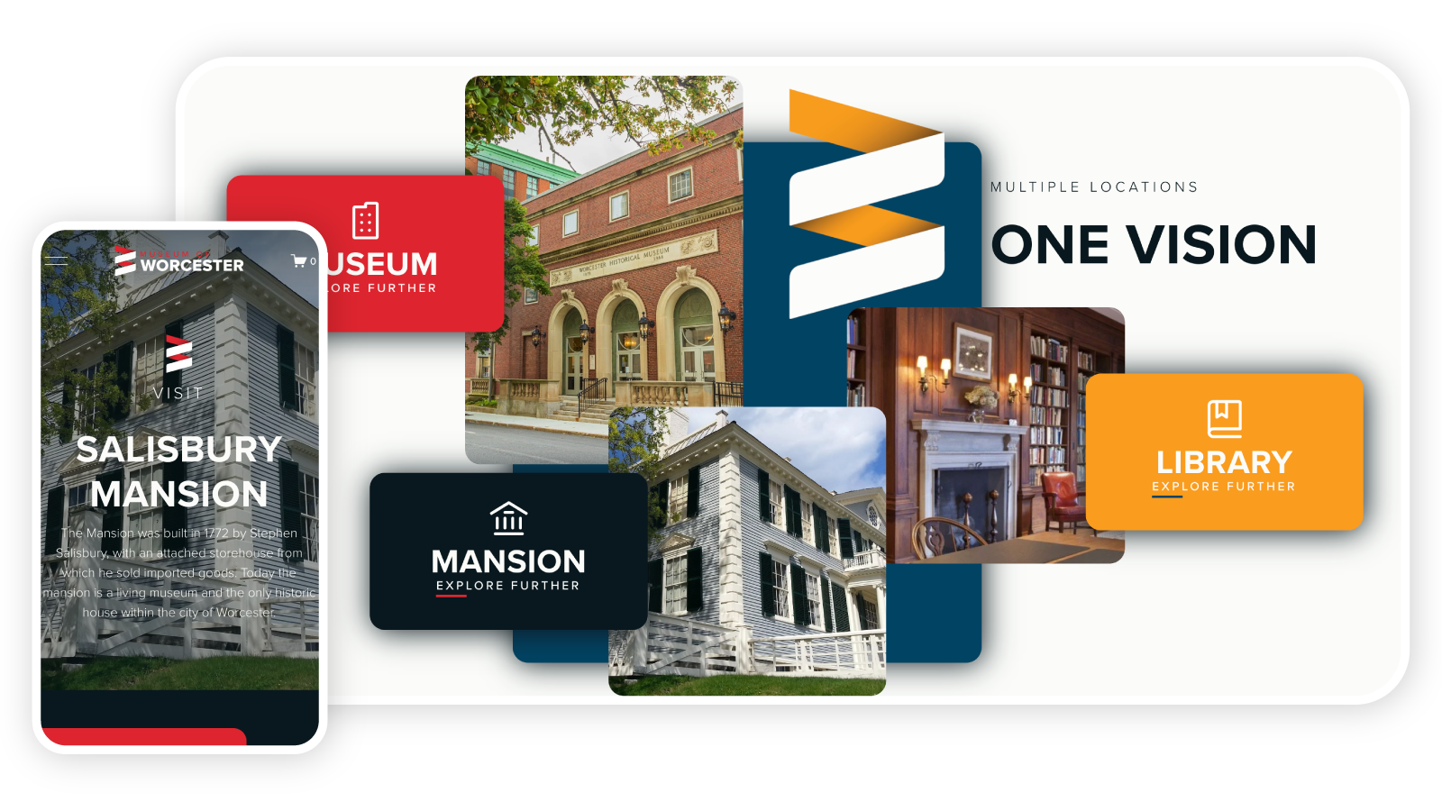
One of the most important decisions involved the museum’s three locations: the main museum, the research library, and the Salisbury Mansion. The old site treated them almost as separate entities. The new site unifies them under a “One Vision, Multiple Locations” framework, with dedicated subdomains for special initiatives like the 300th anniversary of Worcester and the Worcester LGBTQ+ History Project. I also wrote or edited much of the site’s copy, ensuring the voice matched the new brand: welcoming, confident, forward-looking. The system was built to scale.
Phase Three - Sustain
A Brand Launch Is Not a Finish Line
The Museum of Worcester debuted on January 24, 2025, the institution’s 150th anniversary, alongside a redesigned lobby, a new gift shop, and the $1.3 million reinstallation of the Fuller Gallery of Industrial History. It was engineered to make an impression. And it did.
Ongoing support has included regular website updates and content management, print design for flyers, advertisements, and billboards, and video and motion graphic production. As the relationship continues to evolve, so does the scope. Further exploration is underway about how emerging tools and smarter workflows can help the museum’s lean team do more with less, ensuring the brand continues to work as hard as the people behind it.
What Changed
More Than a Name
The rebrand landed, and the city noticed. The Worcester Business Journal, Spectrum News, Clark University's student paper, and The Worcester Guardian all published features on the name change — consistently returning to the same theme: this was not a cosmetic update.
Profile views within the first year — a direct result of aligning the brand name with how people naturally search.
A legacy institution repositioned not as a relic, but as a living, evolving part of Worcester's community.
The main museum, research library, and Salisbury Mansion now present as a single cohesive experience.
The digital impact was tangible. By aligning the brand name with how people naturally search, the rebrand fundamentally changed the institution’s online visibility. The Google Business Profile generated over 600,000 views within the first year, and the museum’s search presence now consistently rivals the Worcester Art Museum, the city’s largest cultural institution. The old name simply could not achieve that kind of reach.
The museum also opened its doors for free admission throughout the anniversary year, made possible by a charitable foundation gift. Isolating the rebrand’s impact from free admission is difficult, and I will not pretend otherwise. But the brand gave the museum something to celebrate beyond the milestone: a new identity, a new digital home, a new way of presenting itself to the people it serves.
The brand now reflects what the team always knew: this is not a building that looks backward. It is a living, evolving part of the city.
The Museum of Worcester is a different institution than the Worcester Historical Museum. Not in its mission, but in how it presents that mission to the world. Three distinct locations now present as one cohesive experience. The visual identity flexes across everything from formal galas to community outreach, from billboards to digital campaigns. And the website went from an outdated, difficult-to-manage platform into a modern, organized solution the team can own.
Modern, approachable, and human, the Museum of Worcester is ready for the stories of the next one hundred and fifty years.
What’s Yours?
This was their story.
Ready To Get Started?